Wilson Architects and Donovan Hill has staged some nicely tuned interactions for the ground-breaking Translational Research Institute, which uses large expanses of steel structure to enable precision at every point
Used in this project
- Products
- Stramit Speed Deck Ultra®
- Materials
- COLORBOND® steel - Metallic finish
The scientists for whom Wilson Architects and Donovan Hill in Association designed the Translational Research Institute (TRI) at Brisbane's Princess Alexandra Hospital (PAH) are cut from an altogether different cloth than the stereotype of deliberate and painstaking scientist as a monk: the solitary figure retiring to ponder the mysteries of the universe while seeking a 'light bulb' moment.
As architect and former DH Principal Timothy Hill suggests, the scientist is "the new leading citizen" who requires accommodation "not as a technician, but as a high-level precious member of society".
The TRI touts itself as Australia's most comprehensive medical research and biopharmaceutical facility, housing four major research institutions: the University of Queensland's Diamantina Institute, the Queensland University of Technology's Institute of Health and Biomedical Innovation, the Mater Medical Research Institute and the Princess Alexandra Hospital's Collaborative Centre for Health Research and Education.
The TRI's design encourages collaboration and innovation, and places its four partnering institutions, comprising 650 researchers and 300 other staff, at a single address. The idea behind the collaboration is to improve and accelerate medical research and to translate that research into greater palliative care. For the first time in Australia, biopharmaceuticals and treatments can be discovered, produced, clinically tested and manufactured in one location, in a process known as 'bench-to-bedside care'. The aim is to focus on a wide range of health and medical research areas including cancer, inflammation and infection, obesity and diabetes.
TRI's design reflects a concern with preciousness, in its non-pejorative sense, alongside a rigorous plan that encourages communication and disintegrates compartments, and hierarchies.
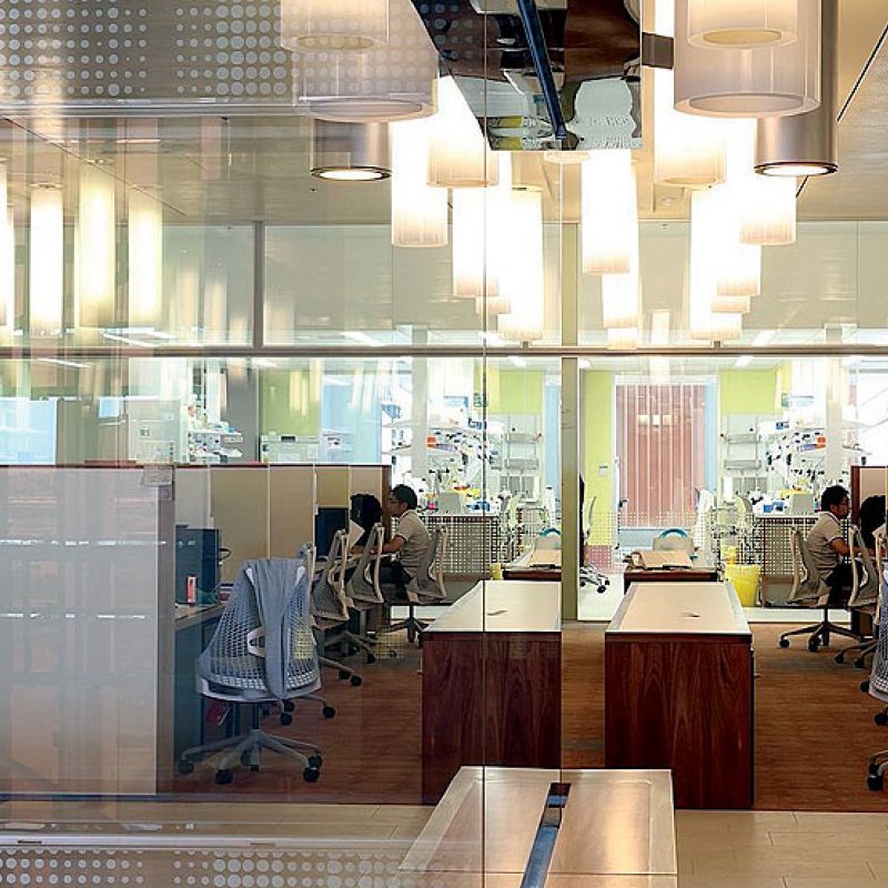
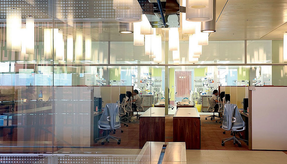
"There's a deliberate blurring between workplace and laboratory here," says Hill. "The two are usually so distinct, but here we used steel to do the 'quiet work', and to make everything demonstrably personal, unlike a typical corporate or laboratory space."
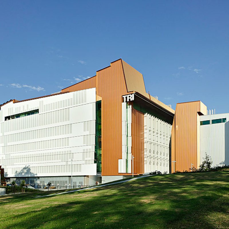
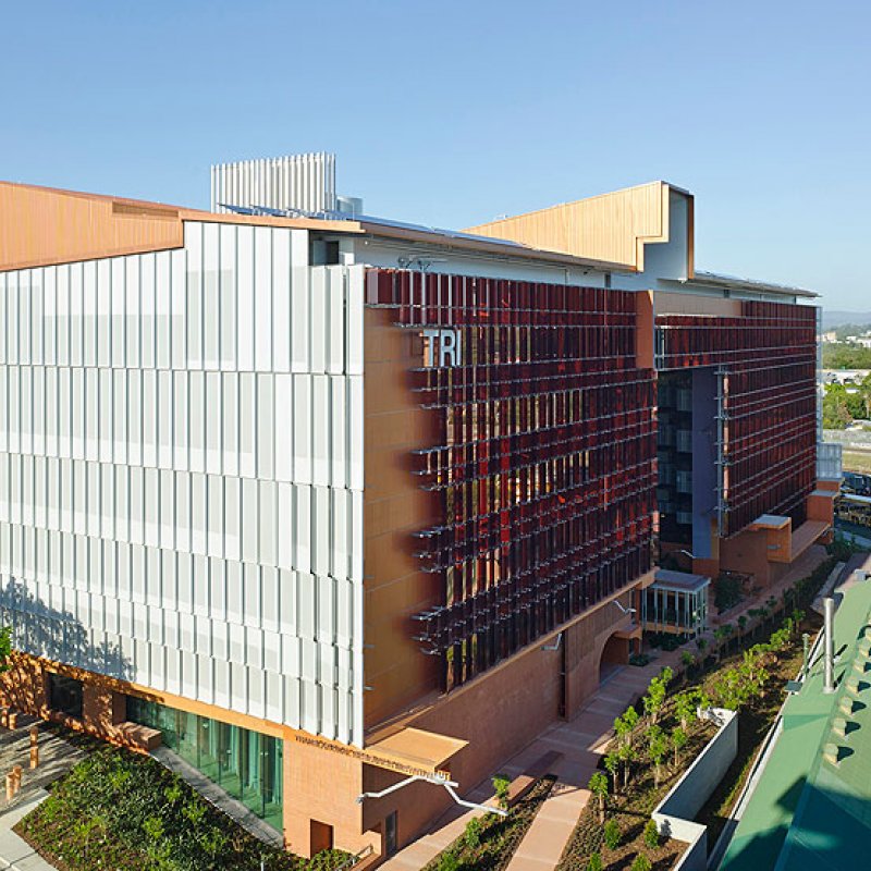
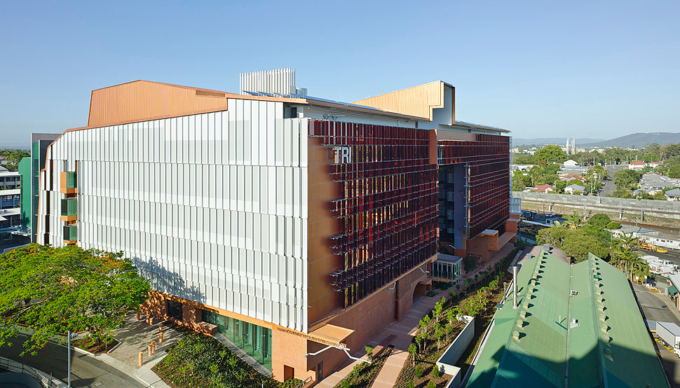
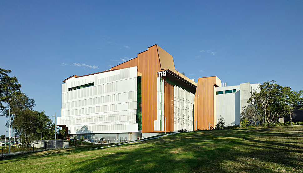
The building's roof – covered with COLORBOND® steel Copper Penny™* in a Metallic finish in Stramit Speed Deck Ultra® profile – houses a large array of equipment, and is attached using steel supports. Its shape from a distance takes on the form of a hilltop, extending the silhouette of the mountains on the edge of the city. "The lifting of the roof was a great moment," recalls Hamilton Wilson, managing director of Wilson Architects. "There was so much to fit under it, and we could only get such wide spans by using steel.
At every point, it is the steel which enables the precision of the building, says Wilson.
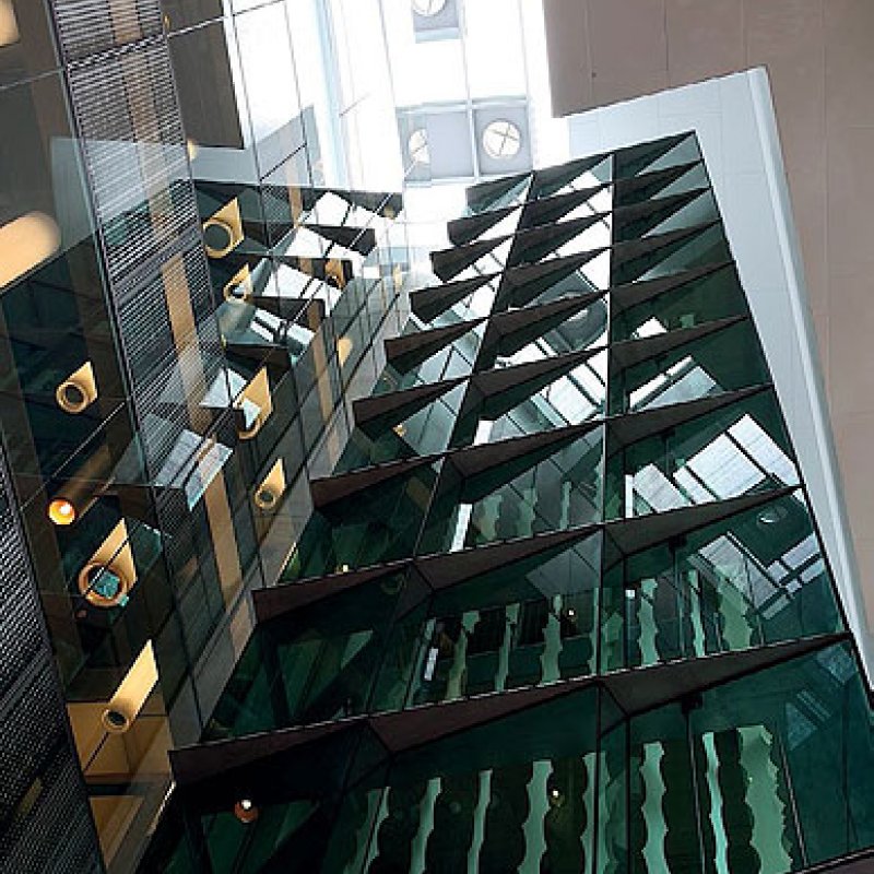
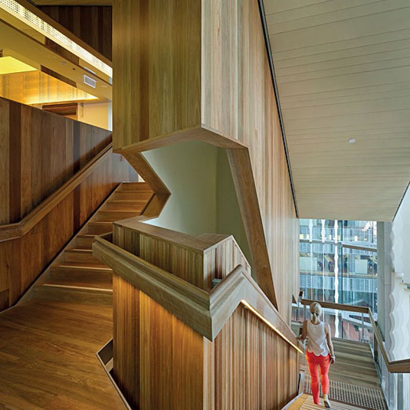
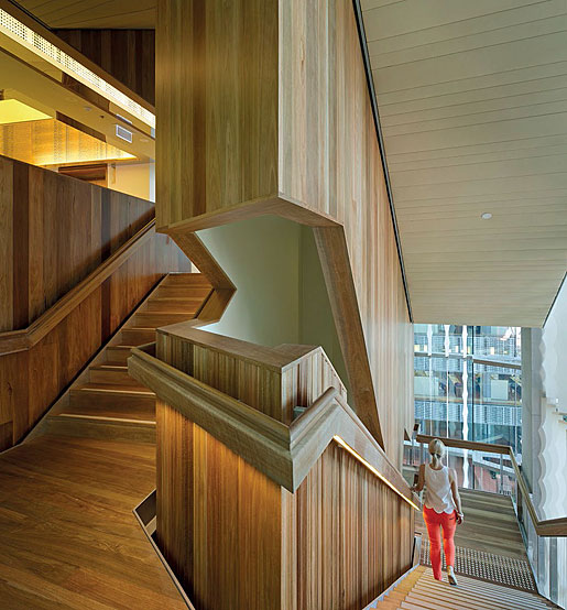
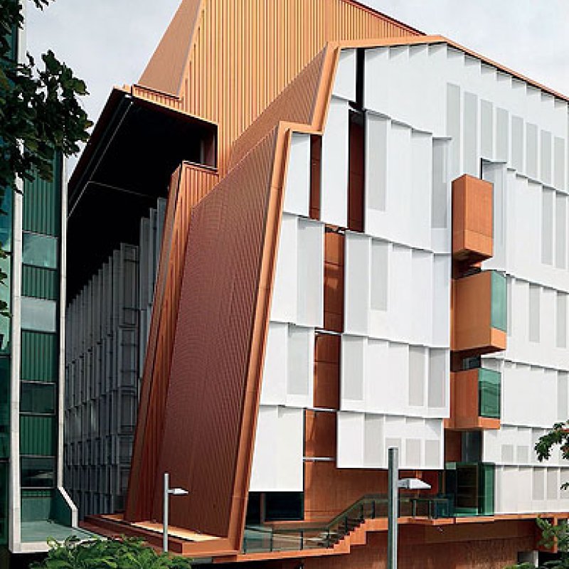
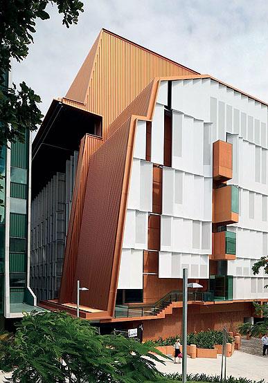
Steel supports the slab that holds the glass wall and the concrete frame of the building. It is conceived as a shell from which the steelwork is "arrayed as an intermediary around and above it to which the outer facade is clipped", he notes. An elegantly thin kinked stairwell projects into the outdoor room, its load taken by steel support plates.
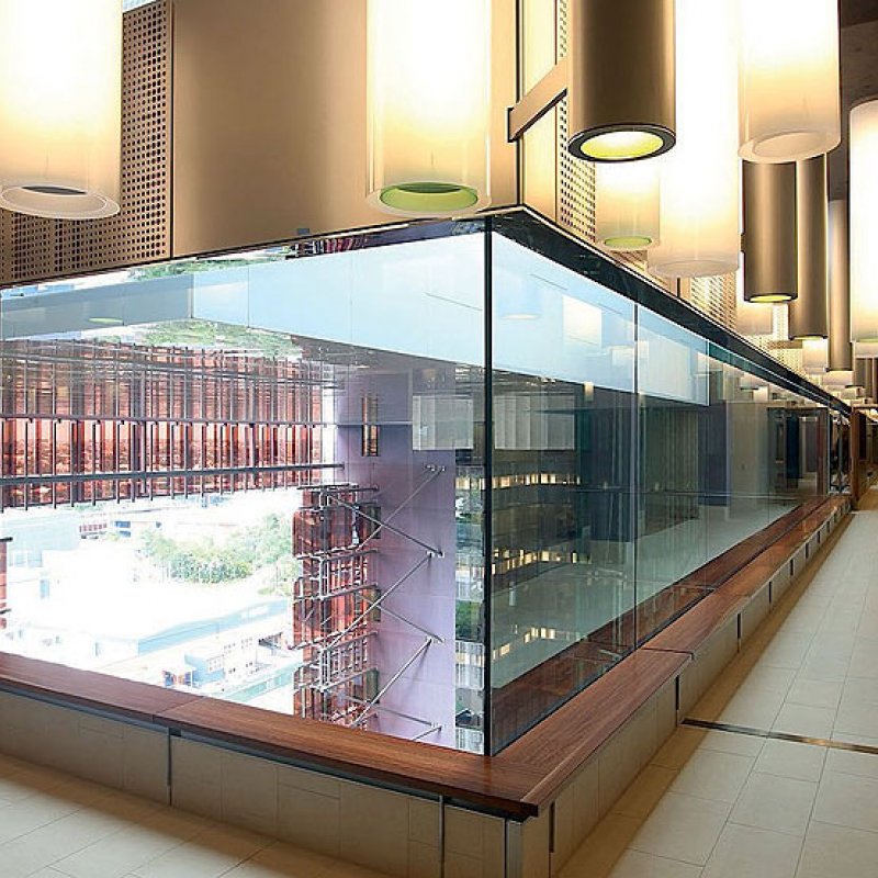
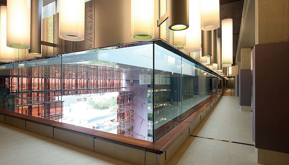
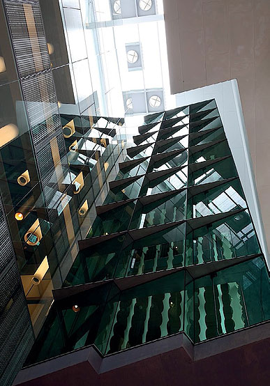
A sunscreen of perforated aluminium shades is clipped to the exterior elevations and supported by galvanised steel. The system was pre-tested for wind whistles and optics, establishing the optimum quantity of appropriately scaled and positioned apertures for ultraviolet penetration and vistas. Pinned with precision to the eastern and western elevations, the articulated, blanched screens contrast with the rose-tinted facets of the engineered glass that frame the outdoor room to the north and with the monumental wall cladding that wraps down the building's southern side.
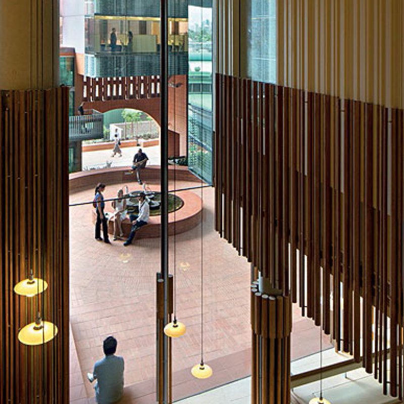
The wall cladding made from COLORBOND® steel Copper Penny* in a Metallic finish, in Stramit Speed Deck Ultra® profile, picks up on a palette introduced through the vibrant wall of rose glass and the terracotta bricks of the outdoor room.
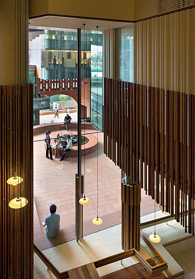
Optical trickery is used to play with the scale of the building, and is enabled by the use of structural steel. The "huge, dry inexpressive floor plates", as Hill calls them, are countered by the seemingly huge outdoor atrium. "You understand the size of the building through the size of the outdoor room, which is surprisingly small in plan, rather than the floor plates," says Wilson. "It establishes a sense of comfort in its scale and in the multitude of wrought details," he concludes.
*Copper Penny™ is a COLORBOND® steel Custom colour.


